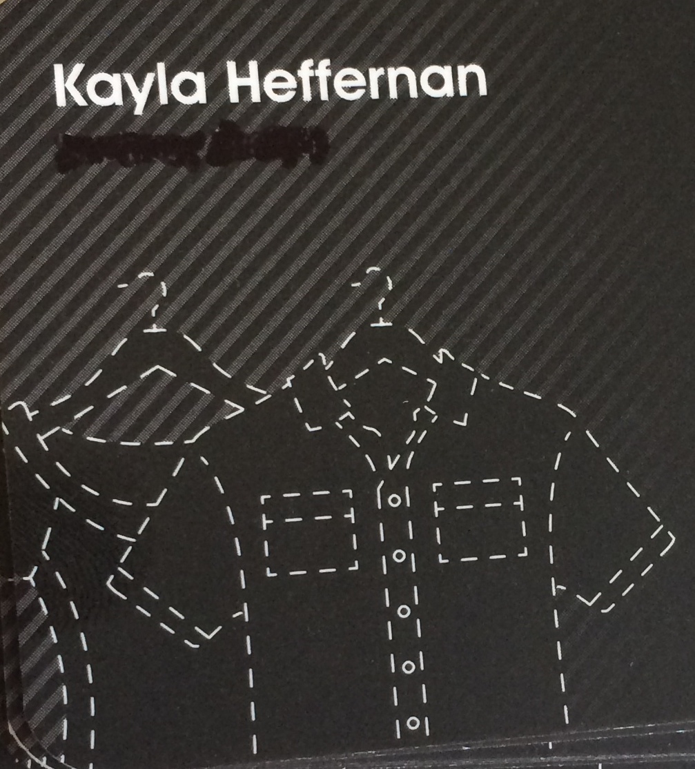
Currently 'in-between' business cards, I have some temporary cards that I've being using. Last night I was attending a networking event, but inadvertently forgot my temporary cards - a potential crisis; you can't attend a networking event without business cards!
After a brief panic, I decided to attack my old business cards with a sharpie to black out my old title. I didn't want to be introducing myself as a UX Designer, then handing out a business card that said something else. This looked... sub-par, to say the least. This card also doesn't have my website on it and has an email address I prefer not to be contacted on.
After another brief panic I looked around the desk, to the tools at my disposal - the tools of the UX trade. Shapries, post-it notes, system cards for user stories.
In typical UX style, I began prototyping what the make-shift post-it 'business cards' would look like. I iterated through the designs and ended up with two that I really liked: a 'to do list' and a 'business card prototype'.
I couldn't decide which was better - so I decided to make a bunch of each, hand them out explaining my predicament, and stating I was A/B testing. This ended up being a great conversation starter, showcased my UX process and was pretty memorable. I even created a few 'user story' cards, which I also handed out.
I've decided that my new run of business cards will actually be based off this concept - so if I gave you one, leave a comment about what you thought for my preliminary A/B results!


