This post also appears on Medium
For the past four years I worked in a mature design team at SEEK, who were familiar with how to give, and receive, design critique. Moving to a new organisation, where I am the first UX hire, I needed to get back to basics to get the feedback I need — what is design critique? Why do it? What is involved? How do I give you feedback? What’s this 30–60–90 thing?
What is a Design Critique?
A design critique is a means for a designer to update stakeholders, and peers, on their progress. They should explain the business and user goals and present a design intended to meet these or solve a problem, along with the rationale behind it. Design critiques are about critiquing the product, not the designer.
Why do a Design Critique?
But you’re a designer and I’m not, why do you need my feedback?
Sometimes we are too close to an idea, so we can’t see the forest for the trees. Good ideas can come from anywhere and together we make a stronger design. You can’t have great design, without great feedback. We need technical feedback to ensure our ideas are technically feasible, strategy and business folk to check our ideas are viable. Of course, we also seek outside feedback from real users to confirm .
Design critique helps us:
Understand whether or not the intended goals of a product are met
Understand where to focus our energy to improve the design
Deliver great designs and an even better solution.
What is Involved in a Design Critique?
I will explain the problem, or opportunity, and how it relates to a user and/or business problem. I will then describe my current design solution that I think addresses this. The other members of the critique should:
Discuss how the design is, or isn’t, meeting the stated intended goals, and
Give actionable feedback that will improve the design.
How to Give Great Design Critique
Talk about strengths
Good critique also empowers, it does not just concentrate on what is not working. Understanding what is working well in the design helps you to decide what to keep in the design.
Separate like/hate from good/bad and consider product goals over personal opinions
A good design meets its goals, a bad design does not meet its goals. How does this design fit into the ecosystem in which it lives — e.g. if it’s an Android app and things are usually done a certain way (i.e. material design) so those users know how to use this? If you have diverged, have you done so with intent? Likes and dislikes are irrelevant here.
Ask questions
Don’t make assumptions. If something has not been explained properly, ask why a decision was made.
Don’t try to design a better solution on the spot
“Why don’t we just…”
Focus on what about the current design isn’t meeting its intended purpose. This is actionable feedback that can be addressed by the designer when they have more time, rather than trying to design something better in 2 minutes.
Instead of…
❌ “Why did you do that” try ✅ “What are you trying to achieve by doing x?”
❌ “I don’t like it” try ✅ “I’m not sure that x makes it clear to users they can y”
Let the designer guide you
“oh noes, I’m guilty of those!”
Honestly, me too, even after doing this for over a decade. Sometimes we reallydon’t like a design and can’t articulate why. It’s part of the designers job to get to the why behind your feedback. So, while you should try follow these tips, if you slip up just be open to a designer’s probing.
The 30–60–90 Framework
What’s this 30–60–90 thing? What level of feedback should I give you at each stage? Is this feedback OK?
30% — A rough idea
At 30% I have a rough concept that may or may not be a viable solution to solve a user / business problem. At 30% the designer has not put much time, effort and thought into the concept. It is easy to pivot or throw this away. At this stage I’m looking for:
Ideas, tips or impressions on the idea
Whether or not this is something we should do
If this is the right direction
How to move the concept forward
Go / no go of this idea
60% — A first draft of a set concept
At 60% we have a first draft of the concept. We’ve spent a lot of time and effort to get to this point, so we don’t want to be changing direction drastically unless there is a very good reason to do so (which we should have figured out at the 30% stage). At this stage I’m looking for:
Whether the 30% critique was addressed adequately
Visual / graphic feedback
Feedback on interactive components
Ways to expand the concept
90% — A last check before development
At 90% we are about to hand over to development. By now, we should have tested the design with real users and made updates to address any usability issues found. There should be no drastic changes at this point. This is a final check where we want to be focusing on the minutiae:
Was 60% critique addressed
Nitty gritty grammar
Finalizing copy
Summary
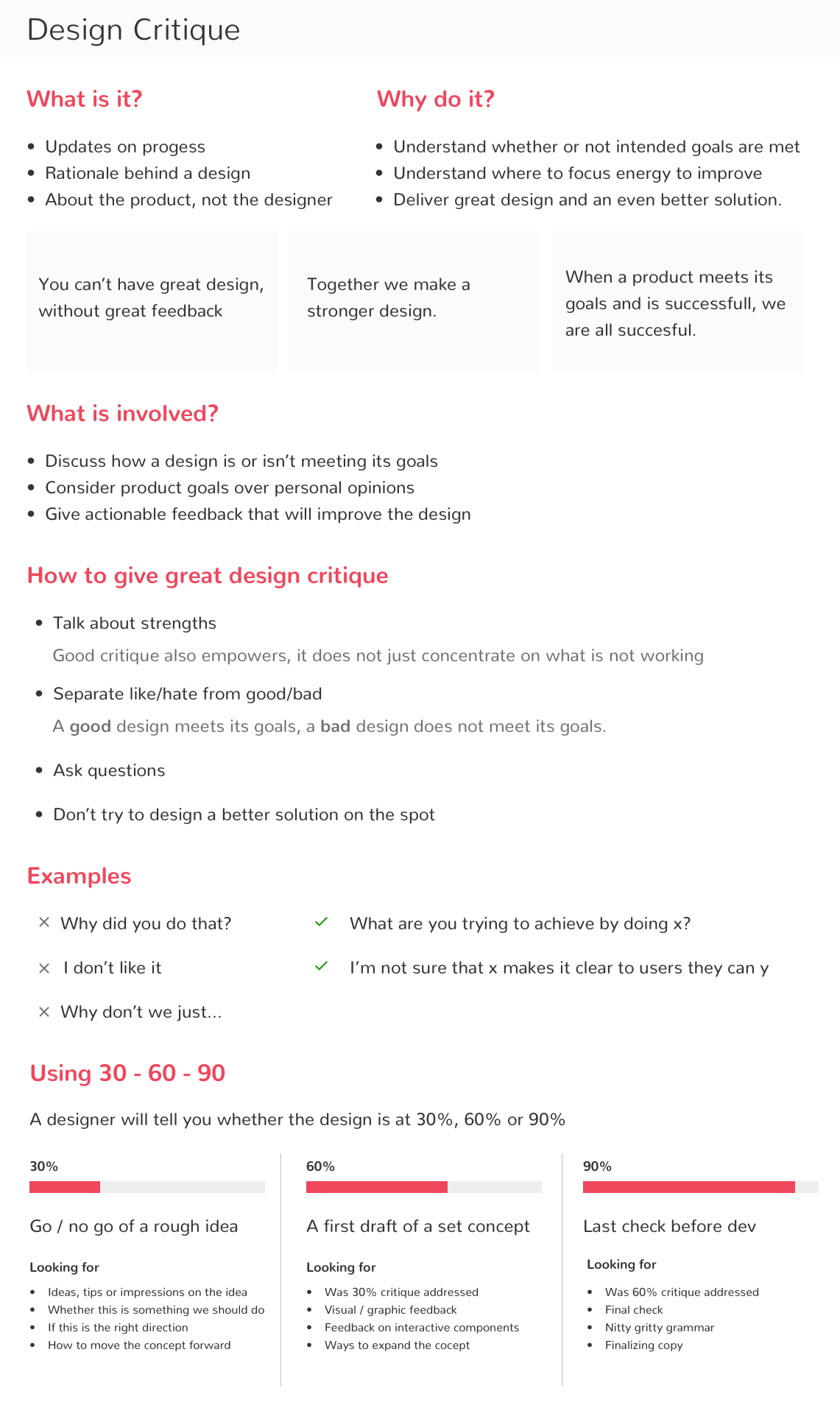
I created and shared this handy reference guide with my team (which formed the basis for this blog post). I am planning on referring back to the “looking for” section each time I elicit feedback, to make it easier for the team.
Design Critique Summary


